Letters can speak to you with different tones: The Cultural Narrative of Arabic Typefaces
Session 5
Saturday, 2 October 2021
11:00 AM CST – 11:30 AM CST
Talk
Emotion
- English
In today's world where digital technologies dominate people's lives and audiences are more inclined to read on digital devices, the media of every language is usually foremost published online on websites. In accordance with these new needs and limitations, designers began to draw outlines compatible with the pixel-based environment of screens in order to maintain the readability and beauty of letters. From the beginning of the digital media boom to the present day, despite the advent of web fonts and the production of new fonts compatible with the web environment in the Persian language, many browsers still use Tahoma Arabic and Segoe UI Arabic as default fonts. The two share visual characteristics and maintain status as standard and accepted font families. From the Persian-type designer's perspective, the design of these fonts has not followed the structural and aesthetic principles of the Arabic script. In this talk, to identify the issues in both fonts, a comparative method will be used to consider four important fundamentals of the Naskh style. The results will show that Tahoma and Segoe Arabic, rather than follow these fundamentals, have been following the geometry of Latin letters, which took away their identity and beauty. Accordingly, the design decision undertaken in these fonts is the result of their designers' lack of knowledge of the structure of the Arabic script.
-
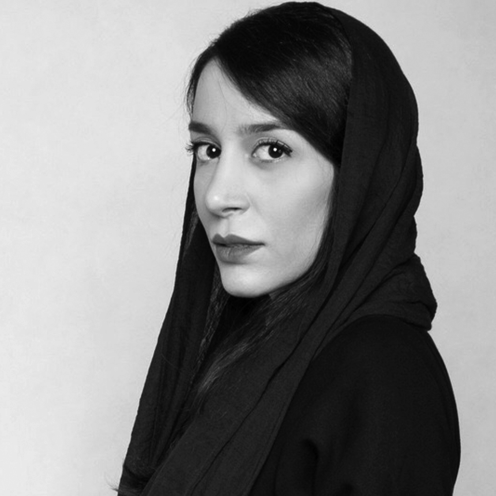
Atefeh Mohammadi
Iran
I am a Graphic Designer with a demonstrated history and education in Islamic calligraphy and Arabic Type design. As a researcher I always sensation about solving Arabic calligraphy problem with typeface technology. Therefore, I wrote some books and articles about this issue


