Contemporary Arabic type between legibility and familiarity
Session 5
Saturday, 2 October 2021
1:00 PM CST – 1:30 PM CST
Talk
Art
- English
In a recent project for a planetary size platform, a disagreement on the features of a “contemporary” Arabic type and what “contemporary” really means caused for the project to be on hold for a year.
The consultant on the project believes that contemporary Arabic Type should have certain aesthetical features. Otherwise, it is more archaic and unsuitable for targeting millions of Arabic readers in 2021. The disagreement inspired me to work on a research project to find what really “contemporary” means in typography and if certain features define contemporary Arabic type and where they came from.
The research that is now the focus of my Master’s thesis at Sandberg Institute leads me to time travel through archives and manuscripts from the 9th century "Blue Qur'an." to The Hamburg Koran edition produced by Abraham Hinckelmann in 1694 and from early digitalized Arabic type for operating systems in the nineties to the most recent use of non-diacritic Arabic on social media to resist algorithm oppressive sovereignty.
The research calls for questioning the measures of modernity in Arabic typography supported by many call by Arabic type designers to take the script as the source of typographic information, to question the criteria of legibility, and to put the light on the importance of familiarity for the Arabic script and its oral origins.
-
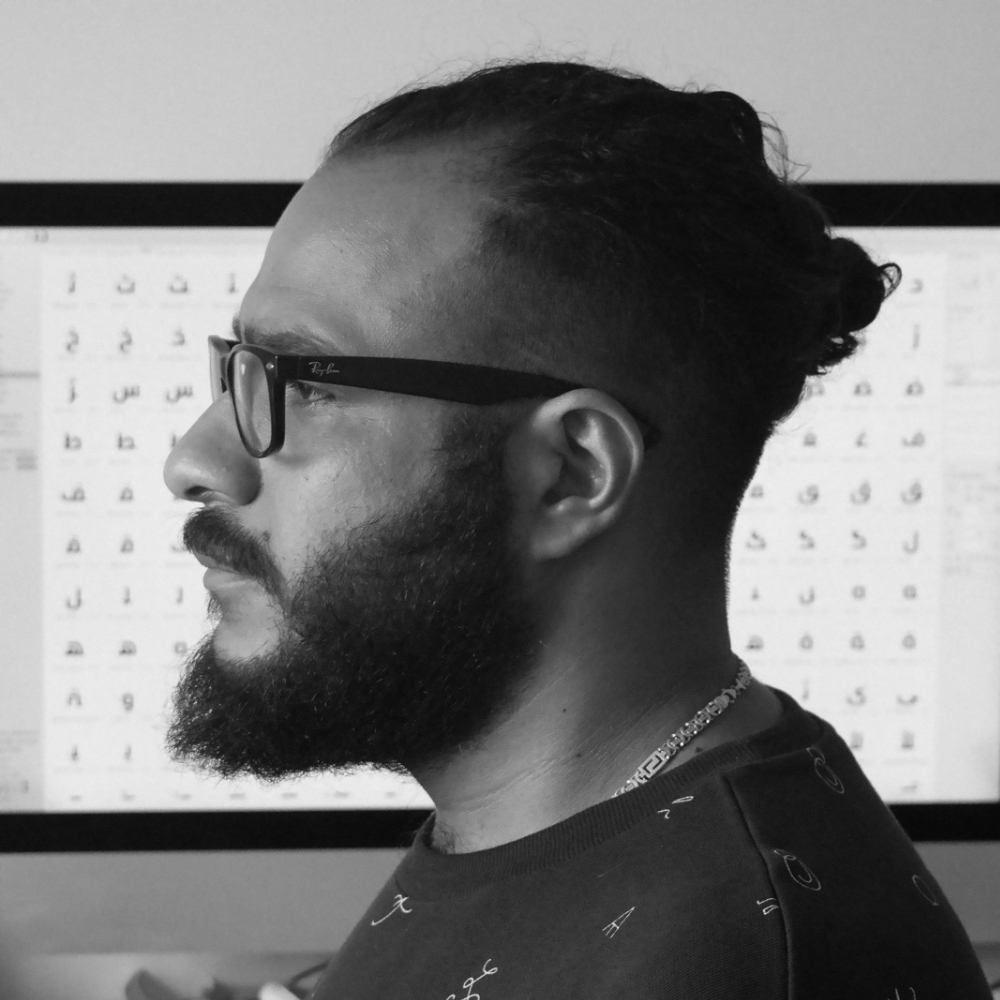
Mohamed Gaber
Netherlands
Mohamed Gaber is a multidisciplinary designer and artist from Cairo, Egypt, now based in the Netherlands to work on his Masters at Sandberg Institute. He works in a wide range of creative disciplines, including type design, web design, graphic design, live VJ, generative art performing, and sound art. His primary interest lies in the haptic nature of the production of typography and the technological, philosophical, and historical aspects of it. While his work is driven by the values of free experimentation and perpetual learning, He draws his inspiration from a broad spectrum of sources, from the slightest variations of handwriting in government documents from the Cairo archives to variable fonts, from traditional calligraphy to quirky typefaces of signs and posters scattered across the city and its post-colonial ghettos where he was born and raised.